

How Interior Designers Layer Color and Pattern So Homes Feel Collected, Not Busy
Key Takeaways
Interior designers layer color and pattern by working with hierarchy, undertones, and restraint rather than treating each element as a standalone choice. When color and pattern are approached holistically, homes feel collected, calm, and intentionally layered rather than visually busy.
Layering color and pattern is one of those things that looks effortless when it’s done well and feels instantly off when it’s not. Homes that feel collected and thoughtful rarely rely on one bold moment or a single pop of color. They’re built through layers. And those layers come from a mix of training, experience, and instinct.
As an interior designer working throughout Orange County and Southern California, I see so much hesitation around color and pattern, especially in coastal homes that default to safe neutrals. That instinct to play it safe is understandable – it’s driven by a fear of getting it wrong. But when color and pattern are layered with intention, they don’t overwhelm a space. They give it character.
Why layered homes feel collected, not busy
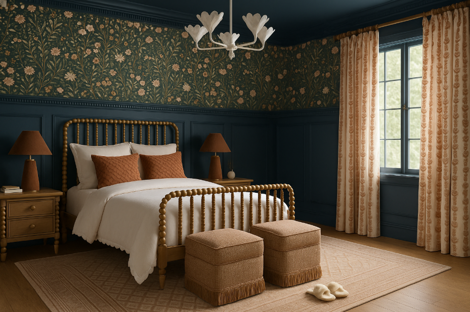
The difference between a layered home and a busy one comes down to hierarchy. In spaces that feel calm, not everything is competing for attention. There is a clear lead or star of the show. Other elements support it. The room is edited so your eye knows where to land and where to rest. This is why homes with color and pattern can still feel quiet and livable. Restraint is what creates that ease, not the absence of interest.
Where color really starts in a professionally designed home
Color does not start with what pairs well together. It starts with undertones.
Understanding color theory goes far beyond knowing which colors complement one another. Undertones determine whether a space feels cohesive or slightly off. A beige might lean pink, green, or yellow. A white can look crisp on its own and suddenly feel creamy or dull once it’s next to warm wood floors or natural stone.
This is often where a trained eye makes the difference. I’ve seen neutrals that look identical until they’re installed side by side, and then the undertone becomes impossible to ignore. These subtleties matter because they affect how every other color in the room reads.

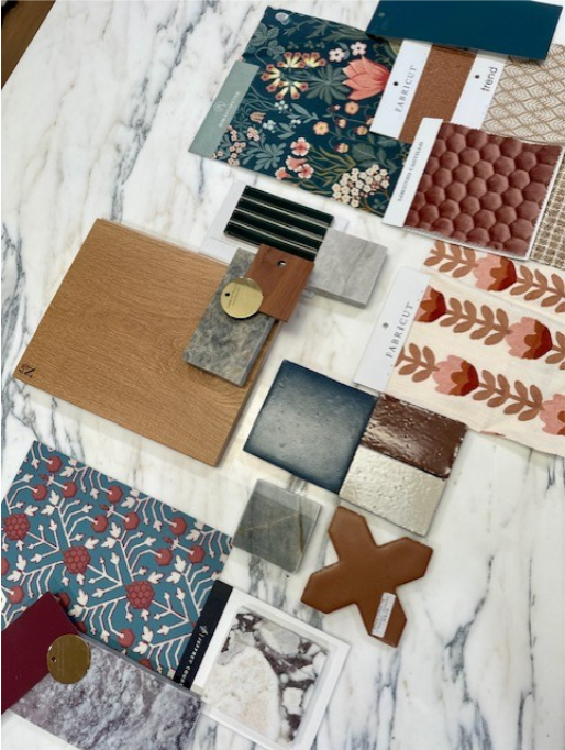
How designers build a color palette that feels layered
Every layered space has a lead color.
From there, two to three supporting colors are introduced. As a general guideline, the lead color might account for up to 60 percent of what you see in a space. Supporting colors might make up around 30 percent, with the remaining 10 percent reserved for accents. Other colors can exist, but they shouldn’t repeat or dominate.
This approach gives a room depth without visual noise. It also creates longevity. When everything is treated as equally important, the space can feel unsettled. A clear hierarchy allows color to feel intentional and refined.
Why architecture should guide pattern choices
Pattern should always respect the architecture of the home.
Before selecting patterns, it’s important to understand the bones of the space. A Spanish style home, a traditional or transitional residence, and a contemporary build each call for different types of pattern and scale. Ignoring architecture often leads to rooms that feel mismatched, even when the individual elements are beautiful.
Pattern works best when it feels like a natural extension of the home rather than something applied on top of it.
How interior designers mix pattern without it feeling overwhelming
Designers think about pattern in terms of balance and scale. A classic guideline is mixing a stripe, a floral, a plaid, and a solid. From there, things can become more nuanced depending on the design style. Scale plays a critical role. Large scale, mid scale, and small scale patterns work together to keep the eye moving without creating competition.
If a room features a large scale floral, it’s usually best not to introduce another bold motif of similar size. Instead, a smaller scale pattern or one that reads more linear adds interest without visual clutter. Throughout this process, the color palette acts as the anchor, keeping everything cohesive.
Why pattern needs space to breathe
Pattern relies on contrast.
Solids give the eye a place to rest and allow patterned elements to feel intentional. If everything is patterned, nothing stands out. This balance is what keeps a space from feeling overly busy.
It’s also important to look beyond pillows and upholstery. Area rugs, drapery, and wall treatments often carry more visual weight and play a significant role in how pattern is experienced within a room.
Where designers actually begin when layering pattern
Most layered spaces start with one clear focal point. This might be an inspiration fabric, a wallpaper, or an area rug. That element sets the tone. Supporting patterns are chosen to complement it, not compete with it. They echo colors, vary in scale, and add interest while allowing the focal piece to remain the star.
When a room already includes bold hard finishes, such as expressive stone or detailed millwork, that hierarchy becomes even more important. One element leads. The rest support.
The role of texture in a layered home
Texture adds depth without adding noise. Textural cottons and linens, woven wools, alpaca, mohair, and sometimes leather all contribute to richness and warmth. Texture softens pattern and gives spaces dimension, even when the color palette is restrained. It’s often the quiet layer that makes a room feel finished.
How designers know when to stop
Editing is what separates layered from overdone.
Throughout the design process, we’re constantly reassessing. Does this support the lead color. Does it compete. Does the space feel better with this element or without it. Knowing when to stop often matters more than knowing what to add (think Coco Chanel).
Collected homes don’t feel that way because they have more. They feel that way because the right things were chosen, placed with intention, and edited with care.
Layering color and pattern is not about following formulas. It’s about understanding balance, respecting the home, and knowing how to edit so a space feels thoughtful and livable. When done well, color and pattern don’t overwhelm a home. They give it character.
For homes throughout Orange County and Southern California, where light, architecture, and lifestyle all influence how color is experienced, thoughtful layering is what allows richer palettes to still feel easy and timeless. If you’re drawn to spaces that feel collected, warm, and quietly confident, working with us can help bring that level of intention to your home.
Frequently asked questions about layering color and pattern
How do interior designers layer color and pattern without it feeling busy?
Interior designers rely on hierarchy and restraint. One color or pattern leads, while others support it, creating balance and allowing the space to feel calm and collected rather than visually crowded.
Where should color start in a professionally designed home?
Color starts with undertones. Designers evaluate how paint, wood, stone, and light interact so the palette feels cohesive across the entire home.
How many colors are typically used in a layered interior?
Most layered spaces use one lead color, two to three supporting colors, and a small number of accents. This structure adds depth without overwhelming the space.
How do designers decide which patterns work together?
Designers vary pattern type and scale while anchoring everything to a consistent color palette. This approach adds interest without competing elements.


Comments Off on How Interior Designers Layer Color and Pattern So Homes Feel Collected, Not Busy